
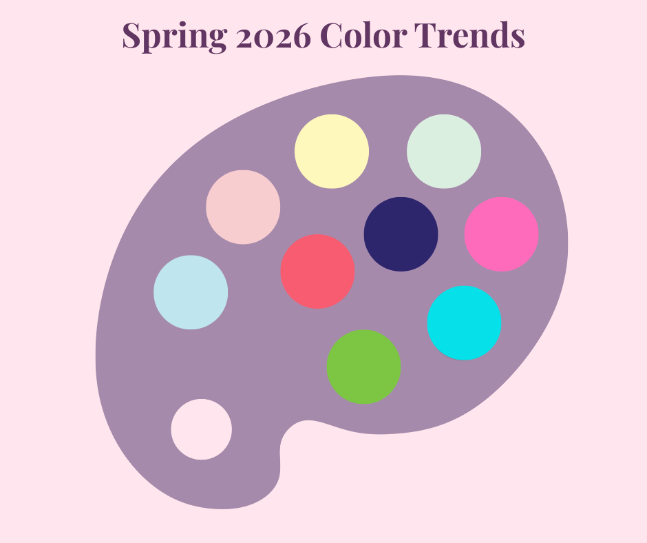
Spring 2026 Color Trends: A Fresh, Joyful Palette for the Season Ahead
As winter begins to soften and the days stretch a little longer, spring invites us to refresh — our homes, our wardrobes, and the colors we surround ourselves with every day.
For Spring 2026, color trends are leaning into optimism, balance, and a sense of ease. We’re seeing a beautiful mix of gentle pastels, joyful brights, and grounding neutrals that work together effortlessly. Whether you love subtle tones or bold pops of color, this season offers something for every style.
Here’s a look at the three key color stories shaping Spring 2026.
Soft Pastels
Light · Airy · Romantic
Soft pastels continue to have their moment, bringing a sense of calm and quiet beauty to spring palettes. These shades feel effortless and timeless — perfect for spaces and accessories that are meant to soothe rather than shout.
Think:
-
Powdery blues
-
Blush pinks
-
Butter yellow
-
Soft mint greens
These colors pair beautifully with natural textures like linen, wood, and canvas, making them ideal for everyday pieces that feel fresh but never fussy.

Fresh Brights
Playful · Optimistic · Confident
Spring wouldn’t be complete without a little color confidence. Fresh brights are making waves in Spring 2026, adding energy and personality to the season’s softer tones.
This palette includes:
-
Vibrant pinks
-
Clear turquoise
-
Fresh green
-
Warm coral
Used thoughtfully, these shades add just the right amount of cheer — whether as a statement piece or a pop of color layered into your everyday style.

Grounding Neutrals
Timeless · Calming · Versatile
Balancing out the season’s lighter and brighter hues are grounding neutrals that add depth and stability. These shades anchor the palette and make mixing colors feel effortless.
Look for:
-
Warm cream
-
Soft gray
-
Charcoal
-
Deep indigo
These neutrals provide the perfect foundation, allowing both pastels and brights to shine while keeping the overall look polished and cohesive.

Bringing It All Together
What makes Spring 2026 color trends especially exciting is how well these palettes work together. Soft pastels set a calming tone, fresh brights add personality, and grounding neutrals create balance.
It’s a season that encourages creativity — mixing colors intuitively, layering tones you love, and choosing pieces that feel joyful and personal.
Whether you’re refreshing your space, your wardrobe, or simply looking for a little seasonal inspiration, these color stories offer a beautiful starting point for spring.
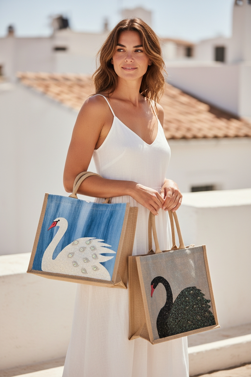
If you’re drawn to these colors, you’ll start seeing them woven into upcoming designs here in the studio.

Written by Dana Harding


Leave a comment
This site is protected by hCaptcha and the hCaptcha Privacy Policy and Terms of Service apply.